14 Web Design Ideas & Tips You Should Check
 Fact-checked
Last Updated: February 2, 2023
Are you under the misconception that the more content you have on your website, the more traffic you’ll attract? When it comes to website designing, less is definitely more.
In this article, our expert team of web designers will share all you need to know about what makes the best clean web designs work. They’ll also analyze and review the cleanest web designs from companies in various industries.
Why Clean Web Design Matters
The more simplistic a website’s design is, the less confused a visitor will feel. If your business brand is luxurious, modern, and simple, you should have an elegant website to match it. A clean web design has a lot of advantages:
- It is usually easy to navigate
- Reflects a modern, sleek, and forward-thinking aesthetic
- Ensures that the visitor sees the main information without distractions
- Has a clear call-to-action
- Loading time is much faster
- Gives the visitor a more relaxed experience
- Conversion rates are better
Web designers can use website builders and build the best clean websites using customizable tools. Platforms like WordPress, give you all the features and training materials on how to make a custom WordPress theme that is clean and simplistic.
| Did You Know: The most important aspects of a clean web design are fast load times, effective navigation, lots of open whitespaces, and an organized layout. |
The Cleanest Web Designs and What You Can Learn From Them
Visually appealing sites usually are uncluttered and simple, and they have the following characteristics:
- Good and simple typography
- Limited color palette
- Consistent imagery
- A lot of open whitespaces
- Minimalistic overall impression
- Simplistic, modern, and professional symbols/logos
- Less information, but all the information included is relevant
- Features main and most important information where it’s easy to find
- Removes any distractions
As a web designer, it’s always a good idea to look at different website design examples for inspiration. Here is an analysis of 14 of the cleanest website designs on the internet, that you can learn from:
Storyblocks
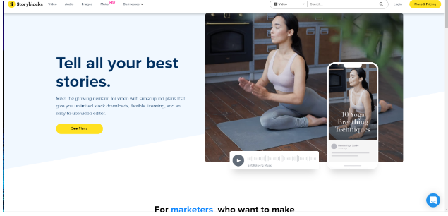
Storyblocks is a site that goes straight to the point. Visitors are immediately drawn to the pricing and plan tabs. They stand out from the simple color palette of the background, inviting action from the visitor. There is a lot of whitespaces too, enhancing the simple design layout.
Using quality images that are placed strategically, the site succeeds in creating a clean website design that doesn’t distract the visitor from the information he is searching for. The only drawback of the site is that someone who isn’t familiar with Storyblocks might have to dig a little bit to understand the concept or service provided by the company.
Themes Kingdom
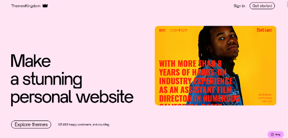
One of the first impressions you get from the Themes Kingdom is that it is aesthetically pleasing. Switching and rotating between a few two-color combinations, the site is extremely modern and attractive. Its design is definitely clean because it has a lot of open space. In this specific instance, the background color is never white, but a toned-down contrasting color to the one dominant in the photo.
The typography is very well picked and has a contemporary look. The page load speed is also very good considering that there is a multitude of quality images on the landing page. It’s a modern website that doesn’t have any unnecessary or overpowering text blocks.
Digital Trends
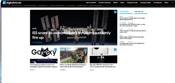
Our team was extremely impressed by Digital Trends’ website. Not only does it succeed in creating a tech-style aesthetic, but it also achieves simplicity while sharing loads of information. Visitors can quickly browse through a variety of article topics to click on the one they are most interested in. Pages are divided into primary categories and a search bar allows you to find relevant topics quickly.
Considering that the site has a lot of information, categories, and educational content it is completely uncluttered. Digital Trends has chosen the best website design for the kind of content it brings to the web. There aren’t any bold or colorful palettes, but rather a simplistic black and white theme with dashes of blue to highlight certain links.
The background is also uncluttered with a clean white appeal. What makes this website’s design even better is the fact that there aren’t any pop-ups or ads flashing while you scroll down the landing page.
Harmonia
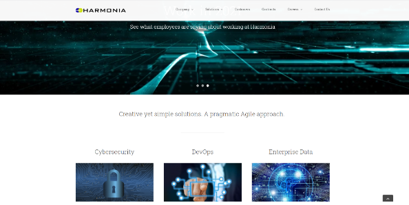
Harmonia doesn’t feature one of the cleanest website design ideas our experts have ever seen, but it succeeds in creating a feeling of simplicity and modernism. It has a very organized layout with quality images and a minimalist design. One of the main factors that put this site on our list is the simple use of typography. Harmonia uses one font style throughout the site’s design that only differs in size. The logo’s font is the only one different from the rest of the text.
The quality images are matched in the same futuristic style that creates a very simplistic yet complementary aesthetic. All images share a tech-type aesthetic with flashing or bright lighting. This in itself gives the user an idea of what the site is about. This makes it unnecessary for Harmonia to explain what they are all about by adding too much content and pop-up boxes.
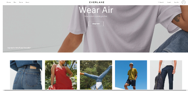
Everlane
Visitors will probably enjoy scrolling down the Everlane site. All clothing categories are neatly organized and placed strategically. Everlane executes a simplistic, clean, and modern website design really well because all the images are in the same colorful style and format.
The site features a lot of whitespaces and keeps text to a minimum. Users can focus on the category type and are prompted to explore by the strategically placed tabs. Even the logo is very simplistic with no extra symbols or images to clutter the header. Users can quickly find what they are looking for because they don’t have to navigate countless images, blog posts, or drop-down menus.
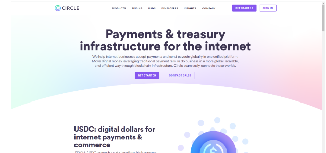
Circle
Circle used great website builders solutions to create their clean site. Our first impression was that the site creates a calm, reassuring user experience. This is achieved by the soft color palette and open space. Even though Circle features more written content on its landing page than other clean modern website design sites, it only shows relevant and helpful information.
The logo and symbols are professionally custom-designed to fit the brand image. Surrounding the symbols there is a lot of open whitespaces that provide relief from reading the elaborate descriptions. In order for the site’s design to be 100% successful, we would recommend that the designers minimize the text even further.
In general, the site is easy to navigate and the page-load speed is also up to par.
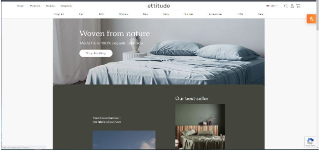
Ettitude
The first impression you get is that this is a luxury brand. It is definitely one of the cleanest and most professional sites we’ve ever come across. The quality images and videos are cleverly picked to represent everything that this online shop stands for. It’s one of the best examples of good websites especially when it comes to creating a site that reflects the company’s mission and aesthetic.
Apart from the unique images and minimalist typography, there isn’t much else to the site. Products are cleverly laid out and put into categories. The most important information is featured in the right spots, ensuring that the visitors don’t have to waste time trying to find what they’re looking for.
Even after a quick scroll through the site, you see that Ettitude has a bestseller, their products are made from 100% organic bamboo, have free shipping, and there’s a 30-night sleep trial. The fact that our experts were able to pick up the most important information within the first few seconds of scrolling, shows that the site is extremely successful in creating an easy, intuitive design.
Key Takeaways
| Unique, professional, and quality images assist in creating a recognizable brand. |
| Beautiful sites use a minimalist design and have an organized layout. |
| An uncluttered website will result in a better user experience and a higher conversion rate. |
| Featuring the main and most important information will encourage visitors to click on the call-to-action buttons much faster. |
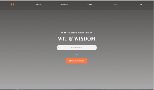
Quotery
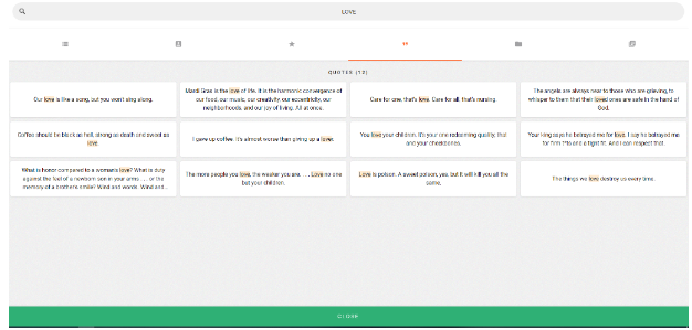
It’s hard to find an example of a cleaner site than the Quotery website. Users are met with a clean open page with a search bar and a few menu options. The homepage design is extremely clever, especially for a site that focuses on inspirational quotes by famous people. One might expect a landing page filled with quotations, inspirational images, and poems, but Quotery is so sleek and modern that it’s completely in line with the current design trends.
Even after searching for a word, you get a very simplistic results page:
There aren’t any distractions; no extravagant typography, blog posts, images, or unnecessary information. Because Quotery meets all the standards of a clean site, we decided that we just had to put it on our simple clean websites list.
MicroStrategy
Using a limited color palette of grey, white, red, and orange, MicroStrategy succeeds in creating a simplistic and clean website design. Although it isn’t very innovative or modern, the site gets straight to the point. Users can easily navigate the site because all information is organized strategically.
Customizing all the video thumbnails is a great idea because it creates a uniform aesthetic that results in an uncluttered page layout. Is it one of the most aesthetically pleasing sites we’ve ever seen? No, but it does meet all the requirements of a clean web design and has one of the best website layouts on the web.
Snowbird
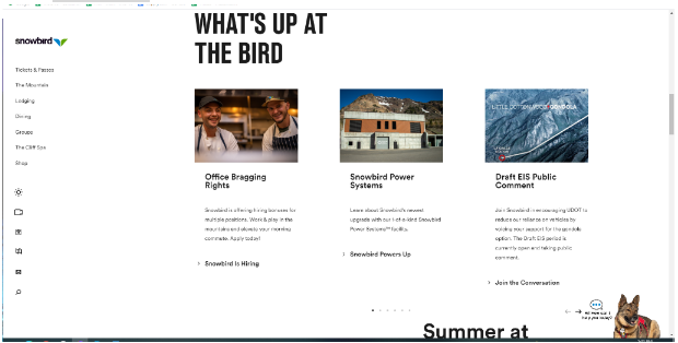
Snowbird’s site shows one of the most successful uses of typography that we’ve seen. Using the same font throughout their site, they only change the size or bold text to draw attention to links. The layout is very organized and spacious, resulting in a relaxed and enjoyable user experience.
The images used are of high quality and the entire site is uncluttered and well put together. It features a lot of open whitespaces and consistent imagery throughout. The little service dog in the lower right corner of the screen creates a fun interactive ‘chatbot’ for visitors to engage with customer service.
Snowbird impressed us so much with its clean site design that we’d rate it as one of the greatest web designs.
Squarespace
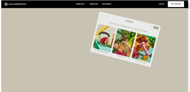
Being a website builder tool, our expectations were really high for Squarespace’s website. And it didn’t fail to completely blow our minds. The site is stunning and extremely aesthetically pleasing. It features a lot of whitespaces and plays around with typography to ensure visitors focus on the main information.
We loved its consistent use of high-quality visuals. Even though some of the images move around when the mouse hovers over them, it isn’t distracting. Using bold text, Squarespace draws a visitor’s attention to the most important information. All written content is minimized and summarized – making it very accessible to all.
Squarespace features one of the most innovative website homepage ideas, especially for businesses that have a lot of products on offer with numerous tools and features to explain.
iArk
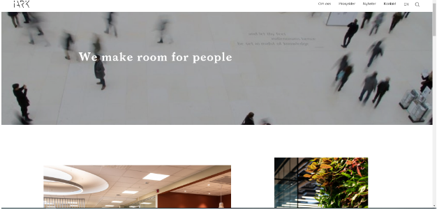
Featuring loads of open background whitespace and consistent imagery, iArk succeeds in creating a clean web design. There is very limited use of typography and no unnecessary information or symbols. It is extremely aesthetically pleasing to scroll through iArk’s site with its elegant web design.
The site is professional, modern, and simplistic. It features a carefully thought-out layout that doesn’t distract the visitor from the main aim of the site itself. Unique images showcase the company’s portfolio. The images are self-explanatory but follow a common pattern and style in order not to confuse the visitor.
This site definitely succeeds because a visitor gets a sense of the company’s style and mission from the layout and use of images, without it being ridden with too much information and other content.
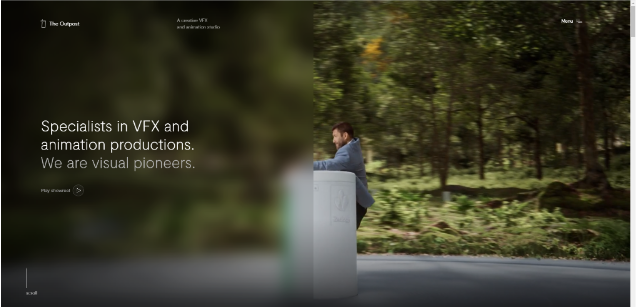
The Outpost
At first glance, we weren’t sure whether The Outpost can fall under clean-design websites, mainly because it features a large screen with video footage on its landing page. The video footage, although engaging and of high quality, combines many different styles and images. Considering that it’s a VFX and animation productions company, it all falls into place, however.
Using simple typography, the rest of the landing page is uncluttered and straight to the point. Even though most clean website designs have a fast page-load speed, The Outpost doesn’t because of the high-quality video footage on display. Regardless, there aren’t any further distractions and it does feature a minimalist overall design.
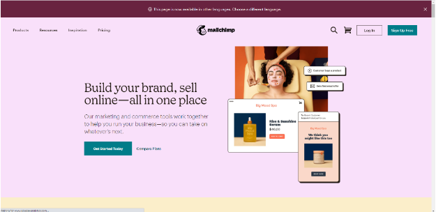
MailChimp
MailChimp is software for online marketing and ecommerce tools. The site succeeds as one of our favorite clean websites because it is fun, yet professional. Even though it uses a lot of colors, it has all the other elements of a clean site. The typography is very well chosen, with some phrases bolded to grab attention. Images are aesthetically pleasing and inspiring.
The site has a lot of open background space that isn’t white, but a very hushed, soft shade of various colors. Users can scroll down the homepage to find loads of information on the service. Regardless of the amount of information presented on the homepage, it’s extremely well laid out with limited (but uniquely designed) images and short descriptions.
| Did You Know: WordPress is one of the top-rated hosting platforms for your website, with numerous free web design templates to help with customizing your page. |
Conclusion
Innovative website designs are becoming more simplistic and minimalistic than ever before. A site is bound to be more engaging and has a higher conversion rate when users can easily navigate through an uncluttered page with an organized layout.
The 14 sites on our list have some of the best clean layouts on the market and are worth exploring for web design inspiration.
FAQ
Clean web design incorporates minimalist typography usage, a good amount of white open space, an organized layout, and the use of quality images. The design is usually uncluttered, innovative, and easy to navigate.
Picking the most stunning website on the internet is impossible since there are so many to choose from. From our list of clean web designs, we thought that the Themes Kingdom and Circle have some of the most beautiful websites.
The cleanest web designs, according to our expert team, are those of Ettitude, Circle, and Harmonia. Other sites that are also impressive are MailChimp, Storyblocks, and the Themes Kingdom.




![How to Find Someone’s Tinder Profile? [2024 Expert Guide]](https://review42.com/wp-content/uploads/2023/06/Finding-Someone-on-Tinder.jpg)

